In an ever-evolving landscape of marketing and advertising, global electronics giant LG has embarked on a bold journey to redefine its brand identity. Introducing the “Life’s Good” campaign, LG aims to infuse a renewed sense of dynamism and youthfulness into its image, while also connecting with customers on a deeper level during times of uncertainty. The campaign, which began on August 22, includes a range of activities, from eye-catching digital out-of-home (OOH) advertisements at iconic landmarks to engaging social media initiatives. This strategic overhaul underscores LG’s commitment to resonating with consumers through meaningful messaging and innovative approaches.
In the ever-evolving world of business, the significance of a corporate identity cannot be overstated. It’s not just a logo or a visual representation; it’s a reflection of an organization’s values, aspirations, and growth trajectory. Honasa Consumer, the holding company of renowned brands such as Mamaearth, The Derma Co., Aqualogica, and House of Brands for personal care, has taken a significant stride by unveiling a reimagined corporate identity that encapsulates its evolution, commitment to innovation, and consumer-centric approach.
The freshly minted corporate identity is a tapestry of three essential elements, each bearing its own symbolism. These elements come together to convey a powerful narrative that resonates with the essence of Honasa Consumer’s journey and ambitions.
The Female Figure: At the core of the redefined identity stands a female figure, embodying the attributes of a nurturing mother. This portrayal symbolises the heart and origin of the organisation, with Mamaearth being the focal point. It’s a testament to the nurturing ethos that Mamaearth, as a brand, has been built upon. This figure serves as a reminder of the values that drive Honasa Consumer’s initiatives and the nurturing spirit that fuels its growth.
The Tree of Life: The inclusion of the tree of life is a visual representation of growth, balance, and prosperity. This emblematic element signifies not only the company’s ascent but also its commitment to maintaining equilibrium and fostering prosperity across its endeavours. Just as a tree grows and flourishes with sturdy roots, Honasa Consumer’s growth is deeply anchored in a strong foundation.
Multihued Circles: The third element comprises multihued circles that represent the fruits of labour and the diverse brand portfolio that Honasa Consumer boasts. Each circle embodies a brand, a project, a success story, or a collaboration. Collectively, they showcase the company’s collaborative spirit and the vibrant spectrum of offerings it brings to the market.
The redesigned logo is more than just a visual change; it’s a statement of the company’s values and aspirations. It encapsulates Honasa Consumer’s agility, clarity, and progressiveness, making it an impactful representation of its identity.
Varun Alagh, co-founder and CEO of Honasa Consumer, articulated the significance of this transformation by stating, “The change in the corporate identity is not just a visual change, it is a representation of our evolution, along with our commitment to innovation, consumer centricity, balance, and growth.” This statement underscores that the corporate identity revamp is a manifestation of the company’s journey, ethos, and future ambitions.
Such a profound transformation in corporate identity is often undertaken with the assistance of marketing agencies and advertising firms. These specialised entities bring their expertise to the table, guiding organisations through the process of reimagining their identity while keeping their brand essence intact. They craft narratives that resonate with consumers, align with the company’s goals, and breathe new life into its visual representation.
The act of revamping a corporate identity is more than a cosmetic change; it’s a strategic move. It not only grabs attention but also sends a clear message to stakeholders, partners, and consumers that the organisation is committed to growth, innovation, and staying aligned with evolving market dynamics. In conclusion, Honasa Consumer’s unveiling of a reimagined corporate identity is more than a visual transformation—it’s a representation of their evolution and commitment to their core values. The amalgamation of the female figure, the tree of life, and the multihued circles forms a compelling narrative that encapsulates the organisation’s journey, aspirations, and diverse brand portfolio. As the corporate world continues to evolve, strategic moves like these serve as testaments to a brand’s resilience, adaptability, and progressive mindset. Such transformations are often facilitated by marketing agencies and advertising firms that understand the intricate dance between identity, narrative, and growth. Honasa Consumer’s journey stands as an inspiring example of how a refreshed identity can redefine a brand’s trajectory and resonate with audiences on a deeper level.
Milap Cosmetics, a leading beauty brand, has recently unveiled its brand-new logo, signifying a remarkable chapter in the company’s journey. Rooted in their unwavering commitment to beauty, empowerment, and timeless elegance, the logo is a true reflection of the brand’s core values. The process of creating this iconic symbol began with meticulously hand-drawn sketches, which were then digitally refined to achieve a flawless design, epitomising perfection and grace.
In a defining moment for the energy industry, Ovo, the renowned challenger brand founded in 2009, is undergoing a remarkable transformation. As the company continues to evolve and expand its services beyond being just a “kilowatt-per-hour energy supplier,” it has decided to embrace its new identity as a major energy player while retaining its cherished challenger spirit. This bold move involves dropping the word “Energy” from its name as part of a comprehensive brand refresh that reflects its maturity as a business. Let’s explore the significance of this strategic decision and how Ovo is poised to solidify its position as a formidable force in the energy market.
Dhiway, a blockchain technology company headquartered in Bangalore, has recently unveiled its new brand logo as part of the brand’s ongoing evolution. The company’s rebranding efforts are aligned with its expansion plans and signify a fresh start and reshaping of its identity. The new brand logo features three circles that symbolize the concept of turning the page and embracing change.
Introduction: Tata Digital, a subsidiary of the Tata Group, has been making waves in the tech industry with its ambitious plans to launch a super app, known as Tata Neu. This strategic move aims to provide a unified platform for various digital services and offerings, catering to the evolving needs of Indian consumers. Pratik Pal, CEO of Tata Digital, recently shared insights on the successful outcome of the company’s super app revamp in an interview with The Economic Times. In this blog post, we delve into the details of Tata Digital’s super app initiative and the potential implications for the Indian tech ecosystem.
In an era of rapid technological advancements and evolving customer needs, businesses are often faced with the challenge of staying relevant and meeting the expectations of their target audience. Recognizing this, YES BANK, a leading private sector bank in India, has recently unveiled its refreshed brand identity, embracing a visual transformation that aligns with the changing times.
Baskin-Robbins is a brand that needs no introduction. For decades, the brand has been synonymous with delicious ice cream treats that delight customers of all ages. Recently, the company unveiled its new brand identity, which is designed to reflect the evolving needs and tastes of its customers.
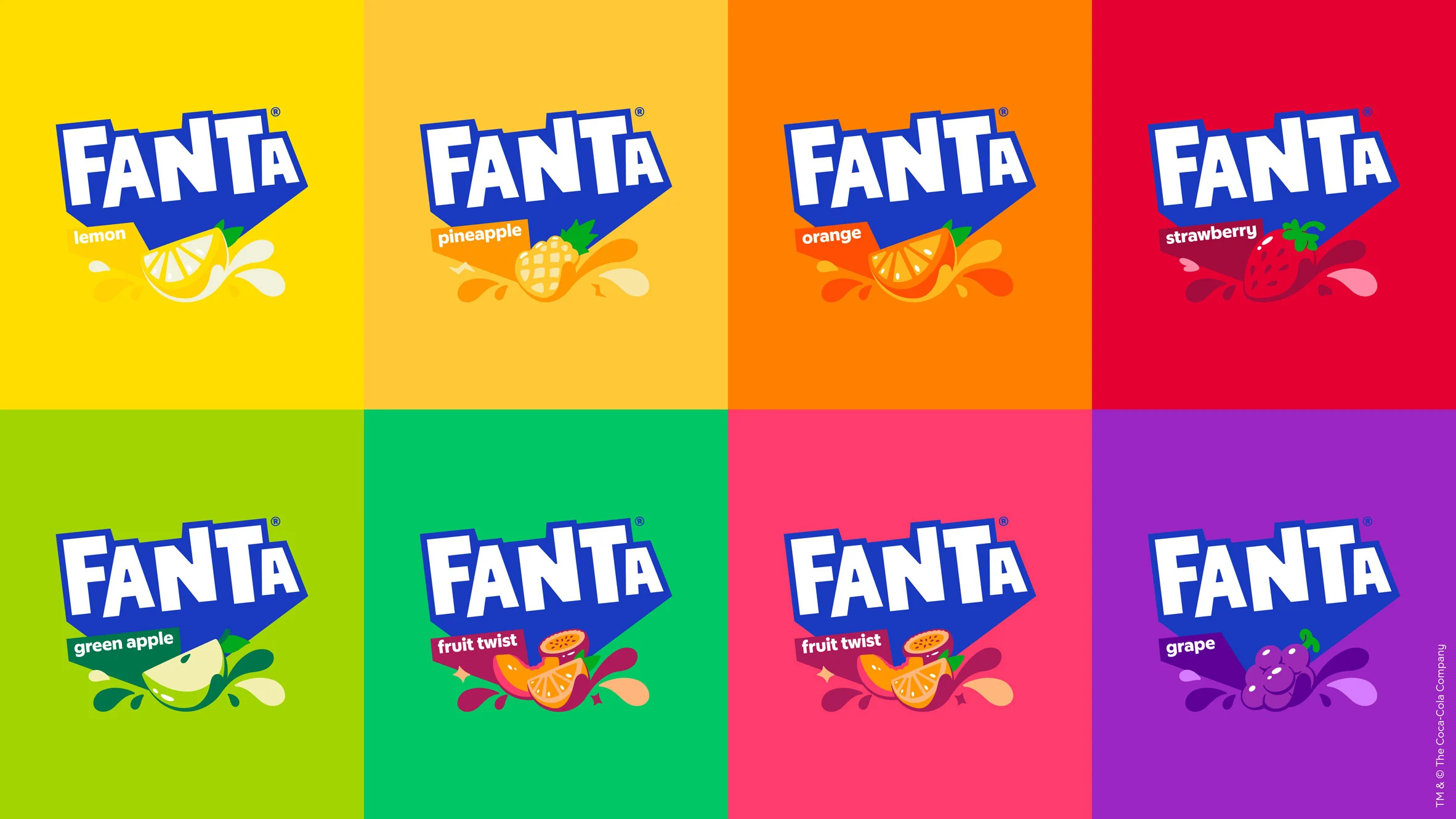
Fanta, the world-famous fruit-flavoured carbonated drink, has undergone a major rebranding exercise. The new design, created by the Berlin-based creative agency Koto, aims to modernise the brand and give it a fresh new look that appeals to young consumers. In this blog, we will take a closer look at the Fanta rebranding and explore the thinking behind the new design.
Nokia changed its logo after using the same logo for over 60 years. The new logo is a modernised version of the iconic Nokia wordmark, featuring a new custom font and a simplified design. The new logo is part of Nokia’s broader rebranding effort, which aims to update the company’s visual identity and better reflect its focus on cutting-edge technologies such as 5G, cloud computing, and the Internet of Things.